Builders Windows and Doors – Facades Remodeling
Oranjestad, Aruba


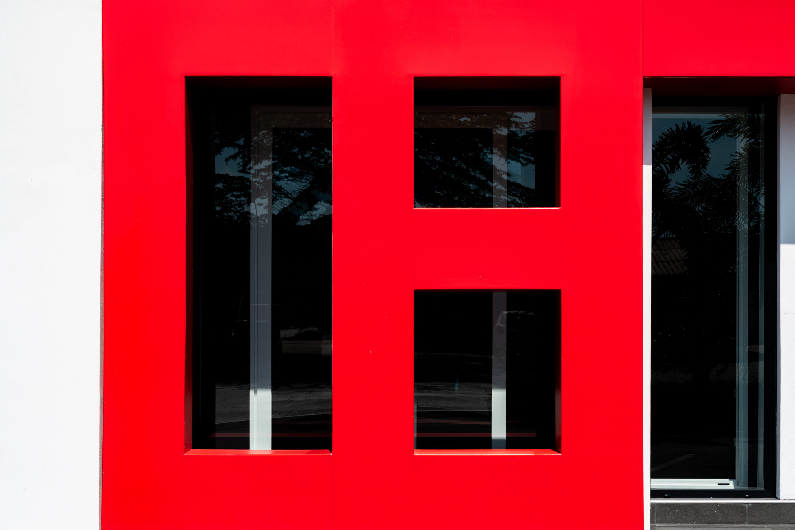
A transformation that undoubtedly makes an impact due to its majesty and intensity.
An intensity brought by the dominant color: red.
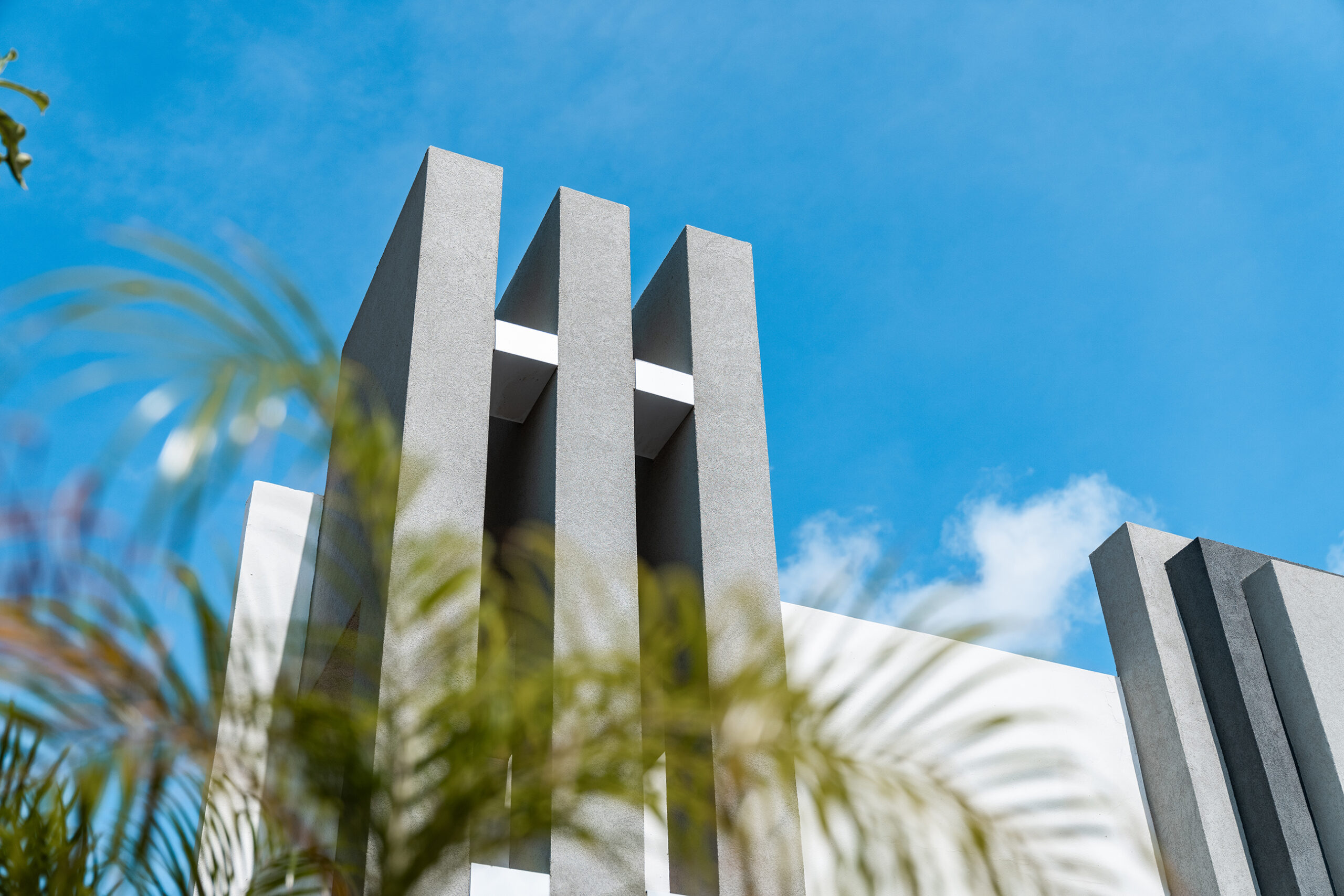
This shift leads us from ornate cornices to clean, minimalist lines.
For the overall concept, we drew inspiration from the company’s logo. The logo plays a crucial role in defining a brand, as it reflects both the company’s identity and the products or services it offers.


Situated on a corner, this building’s design begins from that point, extending the company’s identity in a larger format across the structure. The design flows outward, embracing the building’s sides. Additionally, a large vertical white element divides the space, creating a striking contrast while framing the company’s name in bold prominence.
Another tone that could enhance this design is black, undoubtedly the perfect choice to create balance and harmony. It adds depth and contrast, resulting in a striking visual impact that captivates the viewer.
Finally, we have created a customized design that features a distinct and powerful identity, reflecting the essence of the brand in every detail.
We hope you enjoyed reading and learning more about this project.
Check out more projects like this here:


